Via the dieline
Wednesday, June 2, 2010
Wednesday, May 5, 2010


Saturday, April 3, 2010


Tuesday, March 30, 2010
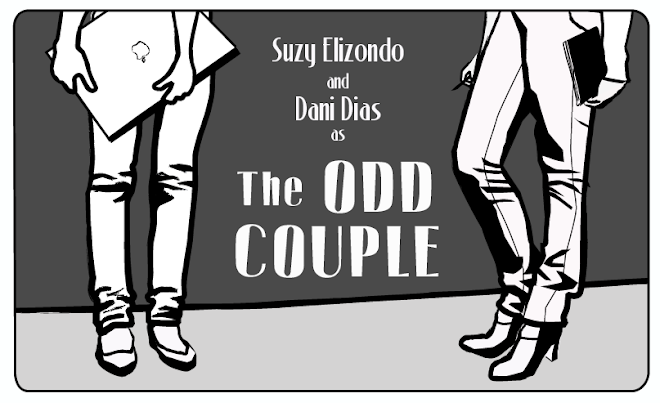
How to Think Like a Great Graphic Designer
How to Think Like a Great Graphic Designer is a book compiled by Debbie Millman. Although the title is slightly deceiving, this book is still a great read so far. It is not a how-to-be-great book, but rather a compilation of interviews with some of the most influential designers in modern history. A lot of what these designers are saying really rings true for me and I just wanted to share a couple of excerpts.
I'm not too far along just yet, but already what I've read has been influential and inspiring.
Michael Bierut: "It doesn't matter if you didn't have enough time or if the client was an idiot. The only thing that counts is what you've designed, and whether it's good or bad."
This quote is the kind of slap in the face you need sometimes when you look around and realize all you've been creating at your job is rushed quick solutions to pushy clients' problems. You know, how most of the work you create at your job isn't the kind of stuff you'd put into a portfolio.
Milton Glaser (the guy who designed I<3NY): Question: how important was financial success when you first started out?
Answer: "Not at all. i never had the model of financial success as being the reason to work. For me, work was about survival, I had to work in order to have any sense of being human. If I wasn't working or making something, I was very nervous and unstable."
I love this response. Because this is exactly how I feel some days. Like if I go too many days without creating something I feel like I'm going to explode.
Mostly I like this book because, although she is interviewing design royalty, their thought-processes and beliefs are still very human and relatable. Reading it makes me feel like I'm somewhat in the right mindset for being the creative person I'd like to be. If you get a chance, you should definitely check this book out. It's an easy read since you can stop between interviews and they're mostly short and to the point responses.
Enjoy!
Suzy
Sunday, March 21, 2010
IMO
...this would be a good ad for Alzheimer's Disease... or something of the sorts. Add in some good copy to round it out and you've got an ad. But as it stands, it is ridiculousity at it's finest.

Tuesday, March 16, 2010
Feminine woes but at last a woohoo (!)
The history of advertising for womenly products has been, well less than impressive. That is stating it lightly. I've never seen a spot or print ad that I have even remotely liked. The closest they have ever come to making me warm up to their brand is that commercial for the tampon-mini's that were being passed around like candy. I felt alright, they are going somewhere.
A fellow CW ad student (Leanne Amman) just had spot produced with JWT and I have to say I love it. It makes fun at the ridiculousness of the fem prod adv scene and then ends with the human truth that us ladies are always thinking: Why are tampon ads so awful? Finally something good out of the long long bad bad history of feminine advertising. The spot below:
I also have been wanting to post on another "woman problem" advertising wave: LBL (light bladder leakage) Again, something no one wants to hear or talk about, we'd rather pretend it doesn't happen. (When I was younger I saw SNL's "oops I crapped my pants" spoof and I was scarred for life. But I digress...)
Here is Whoopi's take on the situation, again poking fun and making light of this awkward phenomenon. What do you think of it? Are we there yet? Is this another product we need to push under the rug and not talk about? I watched Whoopi on The View speaking about her battle about this and I personally and immaturely said "Ew Whoopi just quiet down and put on a pad"... almost as if she were speaking directly to me, she said that there are silly people who think you can use a pad, when pad's are not equipped to welcome anything other than... well... aunt flo. The spot below:
VS
Thursday, March 4, 2010
Twittersphere pollution


Wednesday, March 3, 2010
Pantone Make Up Concepts
Pantone Make Up Concepts: "
Two concepts by Renata Viega, a São Paulo, Brazil based designer....
( Visit TheDieline.com!)
Tuesday, March 2, 2010
Google=big brother?

Artist Stéphane Massa-Bidal has created a series of posters that make you look at Google's authority and access to our lives in a new way. Trust. in. Google?
via bf4b
Tuesday, February 23, 2010

Truth
Just a quick print ad I like. One of those that rings really true. This is exactly what happens to my exercise bike when I put it in my room. It's a great place to hang scarves and the seat makes a nice shelving unit. Although I WILL say the rest of the room in this ad looks a little too tidy.
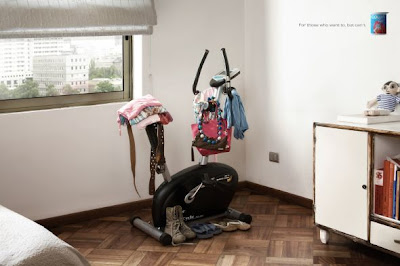
(via Ads of the World)

(via Ads of the World)
Fontastic
a pizza pocket, suitable for framing:

This almost makes me want to eat a hot pocket. Almost.
My point in posting this is a copywriter can only d r e a m of their copy being laid out so seamlessly... swoon

This almost makes me want to eat a hot pocket. Almost.
My point in posting this is a copywriter can only d r e a m of their copy being laid out so seamlessly... swoon
Monday, February 22, 2010
Designing your Portfolio

I just came across this wonderful idea for a compilation, called Flaunt. Any one in any of the creative arts needs to create a portfolio, and I know from experience it's hard to just pull that kind of creative structure from thin air. It takes a lot of thought and sketching and playing around and tweaks and feedback, etc. This book though, seems like a good place for someone to start as they're beginning to think about their books. They've interviewed many creatives on their book-creating process and include pictures and examples of what a portfolio can be. So you get to see a variety of ways the same thing could be executed. It's a really great way to get to see what others out there are doing so you can get an idea of how on par you are with the rest.
Saturday, February 20, 2010
Nice Package
ABC Paper Cups: Super Sweet paper cups? You can spell out fun things with them (obvi).
purchase them at Imagine and Make.


purchase them at Imagine and Make.


images via The Dieline
Friday, February 19, 2010
Eye on the wounded Tiger

Tiger Woods
Now we are taught in advertising that when something negative happens to your brand you do NOT bring it up and apologize. It seems counter-intuitive, but you do not want to aid in reminding people the bad X,Y, and Z that happened to your brand. You instead take a break, and then come back strong reminding people of what good is in your brand, and all the good it has done. People are simple, and within a ridiculously short amount of time they will forget and move on to the next scandal. Now allow me to be so bold and say that Celebrities are essentially products. They are for sale and boy do we buy them and anything they touch. So when handling press, they must be treated like a product. Tiger, heed my advice and fire your PR agent/agents. Then suggest a public flogging for what they allowed you to do. You are not a public speaker, and should never be allowed behind anything save a nine iron. Besides the actual speech being poorly written, the delivery was heartless and reminded me of those awkward exercises from my middle school speech class.
Perhaps I am being harsh. No wait, I am not. We don't need to know about how you are going to treatment and patching things up with your wife, Perez Hilton will keep us updated—but thanks for the thought. Do yourself a favor and disappear for awhile and stop fanning the flames of this "scandal". I am not condoning his actions, but this is the oldest game in the book: infidelity. Presidents, Holy men, and nobodies have been doing it since time immortal. Go and hide, and try to take care of that wife and precious child of yours.
fin
dani
Women strike back!
the alternate version of that dodge ad:
You probably already saw the emasculated man Dodge ad ('Man's Last Stand') that debuted during the SuperBowl.
There was a ton of internet chatter about the multitude of emasculated men spots (and people in underwear spots), but a handful of NYC creatives took it a step further, and created the female version.
AdAge interviews one of the makers of Woman's Last Stand for the complete back story. Suhweet.
via brandflakesforbreakfast
Thursday, February 11, 2010
Getting LOST

In honor of one of ABC's best tely show EVER I am posting some of my favorite finds regarding LOST mania. Above, two beautiful prints (the left being my favorite; Jack/Casket/Locke) celebrating all that is lost, in a simple retro tri-color sort of way. (hey, I am a copywriter, that's all I see)
I am also obsessing over the "NUMBERS" below—it gives me that eerie feeling...like I have seen it before. It is a talent for an artist to create something that is new but still has a nostalgic quality about it. That is a way to connect to a viewer and keep them thinking about you long after they are gone. Not to mention the fact that the seemless layout seems to speak in Hurley's omnious voice "4, 8, 15...". I love artists that are able to communicate a clear distinct voice in their pieces.

Creatives could only dream of working on an account such as LOST because they live for the unexpected. Take a look at what they did below regarding that dreadful flight: Oceanic 815...

Search Kayak for flights from Sydney’s SYD airport to Los Angeles’s LAX and you’ll see that Oceanic Flight 815 — the very one that crashed on the mysterious island in the first episode of Lost — is one of your options.
That’s exciting if you’re looking to get stranded on a desert island dotted with smoke monsters, apparitions, crazy science experiments, electromagnetic abnormalities, immortals, polar bears, mysterious hatches, giant four-toed statues and warring factions of scientists.
Pretty neat, we have to say!
Monday, February 8, 2010
Rebranding American Value
To begin with, this project and the images included here are from The Dollar ReDe$ign Project
It's a sort of activism exercise that recognizes that the value of the American dollar has gone to almost nil in the eyes of our foreign counterparts, and that perhaps a rebranding is in order. The entire blog is different submissions of proposed new designs for the US dollar.
I think it would be kind of wonderful if we could get a full rebranding of the dollar to happen (as, let's face it, our paper money is not nearly as beautiful as some other nations out there). While I give our country some credit for attempting recently to embellish our current design a little more, there is so much potential for the dollar to be so much more.
Here are just a few of the ones I liked:

Although I realize this one lacks the sturdiness for longevity, as most likely the ink would wipe off in a day like atm receipts, I like the idea behind it. It very much describes an aspect of the American culture, as more and more of the things in our life are becoming automated and self-activated. This reminds me of how Vegas broke my heart the first time I went there. Naturally, as a kid I envisioned playing the slot machines and hitting the jackpot and having coins upon coins pour out of the winner's slot at me. But when I actually made it to the city, they no longer give out this flow of instant earnings; they print out a receipt for you. Which very much looks like this dollar design, so in a way I like it because it is already a half-truth.

This design I mostly appreciate for the color scheme, as I mildly loath the watered down olive green of our current paper money. You can tell this one was influenced by other foreign designs, with the blending of imagery in the layers, and the coloring as well. I like the imagery of industrialism on the top one, as it adds a level of history.

Okay, and this one I wouldn't seriously consider as a worthy design (for obvious reasons), but I respect that it's a reflection of how our money is being valued lately. And let's face it, I wouldn't put it past our country to start selling ad space on the very dollar itself (although I think our government still views the dollar as sacred so hopefully this wouldn't actually happen).

Rather than use imagery, this design made room for actual text of what our country is supposed to value. Again, the design isn't a far stretch, but I understand the idea of having a daily reminder in your pocket of what our country is supposed to stand for.

This one is what I can most plausibly see being accepted as a new design. It's a clean design, and I like the varying use of colors, as well as the vertical approach. It also pays homage to not only important figures in our country's history, but important achievements our country has made, as well as memorable monuments. Any rebrand that focuses on the good of the company is a strategically sound one.
So there's that. I thought I'd write about something other than the Super Bowl Ads, cause, let's face it, that criticism popped up on twitter as soon as they aired, and I don't doubt there will be plenty of opinions going around. Consider this just another write-up of something American.
-suzy
Saturday, February 6, 2010
SCARIEST VIDEO EVER. behold the future...
In the future, everything will be augmented reality and plastered with banner ads. And making tea will never be easier.
via brandflakesforbreakfast
*I had a hard time watching the entire video, for it made me dizzy, and scared for my life. My future life of course.
Wednesday, February 3, 2010
SImple, Clever Design
This is the kind of thing I can only one day dream of designing. It's so simple and clever and completely the kind of idea where every one goes 'Why didn't I think of that?'

It's the simplest ideas that get overlooked all the time because we tend to think in more complicated ways. Just have to remember to look at what you have and ask 'What could this do without and still get the message across?' I hope to one day have my 15 minutes of design fame by coming up with something as simple and clever as this. One day..
-Suzy
Sunday, January 31, 2010
continuing education
This is a wonderful list created by Jason Santa Maria of books to read to continue your education of design, art direction, and copywriting. I am thoroughly disappointed that I have only read a handful of them, but will be readily righting that wrong shortly.
I will say that the Graphic Designer's Handbook at the bottom of the list is absolutely necessary for any freelance designer, as it explains etiquette, legal, and other necessary information every freelancer should know.
Once I get my hands on a few of these and have delved into them, I'll write a little snippet or two about my thoughts.
-Suzy
Friday, January 29, 2010
Loco Logo Love

plain, simple, no frills. All the right ingredients for a good logo, IMO of course.
Wednesday, January 27, 2010
magic eye

I love this campaign. Not particularly because of the strategy because I think they could have delved into it a lot more instead of just revealing obvious words (although the message is fitting with the execution). But I love the execution. What I'm saying is, I love that they're using magic eye. Because it's interactive. And it makes someone commit to the ad and actually focus on it long enough to see what's behind the pattern. Now, if reading magic eye patterns is like.. my specialty. I know, I know, I'm going to go far in life with this talent. But I can see them in about 3 seconds. But I would say the average person takes up to 30 to fully see the hidden image, and that's a pretty hefty amount of time for one person to spend looking at one ad. So if using the nostalgic appeal of old school magic eye gets people to stop and look again, I think this campaign is a success.


(photos taken from ads of the world)
-suzy
Tuesday, January 26, 2010
working for free
Here is a snippet, from this delightful (yet fake) interaction between a designer and a businessman looking to get design work for free. (full account here)

Although I have a retail job on the side, I still consider myself to be an unemployed creative. Now, as all unemployed creatives do, I patrol craigslist on a regular basis. And I am eternally struggling with the working for free in order to gain experience dilemma. How much free work in exchange for experience is too much? It is okay as long as you're learning something? I mean really, you're doing work. You should get paid for doing that work. In more than just experience, or credit. Really, now when I see 'intern here 30 hrs a week in exchange for school credit' I laugh in my head because I am no longer IN school and therefore, school credit = monopoly money to me.
Regardless, this is what's out there:
=This is an unpaid internship that can be used towards school credit, it offers the opportunity to gain experience, collaborate directly with the on-staff graphic designer, build a portfolio, and work for an established non-profit organization in a professional environment.
=Please note that this is an unpaid internship, but the exposure opportunities for your work are great. We will credit you in the final publication of our book. (The book they want you to design.)
=This is an unpaid internship, but the experience will be priceless.
=This is an unpaid internship; however, with the right qualifications, there can & will be small perks throughout the position.
=Although this is an "unpaid gig" you will be fairly compensated with your own campaign on our website and future exposure in various media opportunities.
-suzy
Monday, January 25, 2010

Sunday, January 24, 2010
Shed those shady friend requests
New Facebook Feature Combats Dodgy Friend Requests:
 Facebook is testing out a new feature that lets you identify strangers who attempt to friend you, according to a report published today by the Inside Facebook blog. Facebook confirmed it’s testing the feature in an email to Mashable.
Ever encountered someone who just can’t take the hint, “I don’t know you, so, no, I do not want to be your friend,” and attempts to friend you over and over again despite numerous rejections? Or have you been spammed by a fake Facebook profile whose friendship you carelessly accepted?
Well, Facebook has the remedy for all of these ills: A new function called “Mark You Don’t Know.” Now, after choosing “ignore” when you receive a friend request, Facebook gives you the option to report said person as a stranger. Check out the screenshots below (here’s hoping Mashable’s Samuel Axon doesn’t get blocked for kindly taking part in this demonstration):


The new feature will likely be a great help to the site and its members, given that it has been a target recently for both phishing attempts and spam. Still, it does seem to be sending mixed messages in the wake of the launch of new privacy features and founder Mark Zuckerberg’s proclamation that sharing is the new “social norm.”
It remains to be seen just how well this new feature will function. In the meantime, let us know what you think in the comments.
via media bistro
Facebook is testing out a new feature that lets you identify strangers who attempt to friend you, according to a report published today by the Inside Facebook blog. Facebook confirmed it’s testing the feature in an email to Mashable.Ever encountered someone who just can’t take the hint, “I don’t know you, so, no, I do not want to be your friend,” and attempts to friend you over and over again despite numerous rejections? Or have you been spammed by a fake Facebook profile whose friendship you carelessly accepted?
Well, Facebook has the remedy for all of these ills: A new function called “Mark You Don’t Know.” Now, after choosing “ignore” when you receive a friend request, Facebook gives you the option to report said person as a stranger. Check out the screenshots below (here’s hoping Mashable’s Samuel Axon doesn’t get blocked for kindly taking part in this demonstration):
The new feature will likely be a great help to the site and its members, given that it has been a target recently for both phishing attempts and spam. Still, it does seem to be sending mixed messages in the wake of the launch of new privacy features and founder Mark Zuckerberg’s proclamation that sharing is the new “social norm.”
It remains to be seen just how well this new feature will function. In the meantime, let us know what you think in the comments.
via media bistro
Keep on Trucking

Sure, it all starts with safety in mind - see a projection of what's in front of the truck displayed on video monitors on the back of the truck. Drivers get to see what's coming, and the truck is no longer a visual obstacle.
But then...our lovable industry will take it over. And before you know it, you'll be watching full-on television productions from the back of the tractor trailer in front of your car. Imagine vampires jumping out at your car to promote a new film, or a new smaller car driving head-on toward you, to as an ad for the car. This is both completely exciting and totally scary at the same time.
via mashable
Friday, January 22, 2010
Procrastination Pyramid

Check out the Hierarchy of Digital Distraction, and all will be clear.
Wednesday, January 20, 2010
Sunday, January 17, 2010


Subscribe to:
Posts (Atom)